How to Create a Responsive Website Header - Part 5
In this detailed web development tutorial, I'll teach you how to create a responsive website header with a dropdown icon bar using HTML, CSS, and JavaScript.
This article, which is part 5 of a 5-part series of Web Development tutorials, will guide you through the process of creating a website header. We'll use HTML, CSS, and JavaScript to construct a header layout with an Icon Bar featuring site, search, and share menus that open and close as needed. In this example, we'll examine a complete web page demonstration before taking a detailed look at the concepts and code that bring it to life.
This article builds upon topics discussed in How to Create a Responsive Website Layout.
In this article, we'll use our standard HTML Document Structure and CSS Naming Convention.
Skip Ahead
Looking for something specific? Select a topic in this article to read more:
Icon Bar
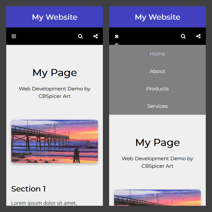
In this example, we'll build upon our Search and Share Bars design to include an icon bar featuring site, search, and share menus that open and close as needed:
An icon bar provides a navigation interface that is well-suited for mobile devices with touch screens (like phones and tablets). It presents visitors with a row of buttons that can be used independently open and close navigation menus as needed. This creates a compact design that allows much of the main content area to be shown above the scroll.
On small screens, the site menu behaves as an accordion. On medium and large screens, the site menu is displayed as a static, horizontal bar. On all screens, the search and share menus behave as dropdowns. When a visitor selects a button from the icon bar, the corresponding menu opens. When a visitor deselects a button from the icon bar, the corresponding menu closes.
Header Structure and Style
First, we create our header area.
The construction of the header area is identical to our Search and Share Bars design.
Let's start with the HTML used to create the header area for our responsive icon bar design:
HTML
<!-- Header -->


<header class="header">


  <!-- Title -->


  ...


  <!-- Navigation Group -->


  ...


</header>
Here we create our header area using the
<header>
element and assign it:
-
The
class="header"attribute to control the layout of the header area
Next the CSS:
CSS
* {

  box-sizing: border-box;

  margin: 0;

  border: 0;

  padding: 0;

}


body {position: relative;}


/* Page */


.page {

  max-width: 640px;

  margin: 0 auto;

}


@media (min-width: 960px) {

  .page {max-width: 960px;}

}


/* Header */


.header {

  font-size: 0;

  text-align: center;

}
First, we create a CSS rule to control the default layout and style of all elements (unless otherwise specified). This rule applies the "border box" sizing model and resets margins, borders, and padding to 0.
Next we create a CSS rule to control the layout of the
body
element.
We include:
-
The
position: relative;property to allow the subnavigation areas to be positioned relative to thebodyelement
Then, we create the
.page
CSS rule to control the layout of our page areas so that:
- The maximum width is 640px on small and medium screens
- The maximum width is 960px on large screens
Finally, we create the
.header
CSS rule to control the layout of our header area.
We include:
-
The
font-size: 0;property to prevent browsers from adding undesirable whitespace around and between the navigation menu items and subnavigation menu items (font size is redefined later so that all text is rendered to the correct size)
Title Structure and Style
The first item inside the header area is our title area.
The construction of the title area is identical to our Multiple-Line Top Header design.
Let's start with the HTML used to create the title area for our responsive icon bar design:
HTML
<!-- Title -->


<div class="title">


  <h1 class="page title_heading">

    <a href="#home"

    class="title_heading_link">

      My Website</a></h1>


</div>
First, we create our title area using the
<div>
element and assign it:
-
The
class="title"attribute to control the style of the title area
Inside the title area we create our title heading using the
<h1>
element and assign it:
-
The
class="page title_heading"attribute to control the layout and style of the title heading
And inside the title heading we use the
<a>
element to create a title heading link that directs visitors to our home page when clicked.
We assign it:
-
The
href="#home"attribute to specify the destination of the title heading link -
The
class="title_heading_link"attribute to control the style of the title heading link
Next the CSS:
CSS
/* Title */


.title {background: #4040BF;}


.title_heading {font: bold 24px / 1.5 sans-serif;}


.title_heading_link {

  display: block;

  padding: 16px;

  text-decoration: none;

  color: #FFFFFF;

}
First, we create the
.title
CSS rule to control the style of our title area.
Next we create the
.title_heading
CSS rule to control the style of our title heading.
Finally, we create the
.title_heading_link
CSS rule to control the style of our title heading link.
Function
To complete our icon bar design, we use JavaScript to add functionality to our layout. Keeping aligned with the principle of "progressive enhancement", our site, search, and share menus remains fully functional for visitors without JavaScript-enabled devices. But for visitors with JavaScript-enabled devices, the accordion and dropdown behavior is added to our site, search, and share menus to provide an improved user experience.
To produce the functionality of the accordion site menu, we add the accordion behavior to the site menu on small screens and initially close it by setting its height to 0. We also show the button required to toggle the site menu.
When the button is clicked to open the site menu, its height is set equal to the height of its content and the search and share menus are closed. When the button is clicked to close the site menu, its height is set back to 0.
To produce the functionality of the dropdown search and share menus, we add the dropdown behavior to the search and share menus on all screens and initially close them by setting their height to 0. We also show the buttons required to toggle the search and share menus.
When the button is clicked to open the search menu, its height is set equal to the height of its content and the search menu is closed. On small screens, the site menu is also closed. When the button is clicked to close the search menu, its height is set back to 0.
When the button is clicked to open the share menu, its height is set equal to the height of its content and the search menu is closed. On small screens, the site menu is also closed. When the button is clicked to close the share menu, its height is set back to 0.
Let's take a look at a step-by-step breakdown of how we want the JavaScript to function:
When the page is loaded or resized:
-
If screen size is small:
- Add accordion behavior to navigation
- Collapse navigation
- Show navigation button
-
If screen size is medium or large:
- Remove accordion behavior from navigation
- Expand navigation
- Hide navigation button
- Add dropdown behavior to all instances of subnavigation
- Collapse all instances of subnavigation
- Show subnavigation button for all instances of subnavigation
When navigation is toggled:
-
If navigation is closed:
- Expand navigation
-
If navigation is open:
- Collapse navigation
- Collapse all instances of subnavigation
- Send all instances of subnavigation to back
When subnavigation is toggled:
-
If screen size is small:
- Collapse navigation
-
If selected instance of subnavigation is closed:
- Collapse all instances of subnavigation
- Send all instances of subnavigation to back
- Expand selected instance of subnavigation
- Bring selected instance of subnavigation to front
-
If selected instance of subnavigation is open:
- Collapse selected instance of subnavigation
- Send selected instance of subnavigation to back
Now the JavaScript that makes it happen:
JavaScript
var screenSize = window.matchMedia("(max-width: 479px)");


// Navigation Variables


var nav = document.getElementsByClassName("nav-1_menu");

var navButton = document.getElementsByClassName("nav-1_button-1");

var subnav = document.getElementsByClassName("nav-2");

var subnavButton = document.getElementsByClassName("nav-1_button-2");


// Initial Setup of Navigation


function navInitial() {

  // If Screen Size is Small

  if (screenSize.matches) {

    // Initial Setup of Navigation

    nav[0].classList.add("accordion");

    nav[0].style.height = "0";

    navButton[0].style.display = "block";

  }

  // If Screen Size is Medium or Large

  else {

    // Initial Setup of Navigation

    nav[0].classList.remove("accordion");

    nav[0].style.height = "auto";

    navButton[0].style.display = "none";

  }

  // For All Instances of Subnavigation

  for (i = 0; i < subnav.length; i++) {

    // Initial Setup of Subnavigation

    subnav[i].classList.add("dropdown");

    subnav[i].style.height = "0";

    subnavButton[i].style.display = "block";

  }

}


// Toggle Navigation


function navToggle() {

  // If Navigation is Closed

  if (nav[0].style.height === "0px") {

    // Open Navigation

    nav[0].style.height = nav[0].scrollHeight + "px";

  }

  // If Navigation is Open

  else {

    // Close Navigation

    nav[0].style.height = "0";

  }

  // For All Instances of Subnavigation

  for (i = 0; i < subnav.length; i++) {

    // Close Subnavigation

    subnav[i].style.height = "0";

    subnav[i].style.zIndex = "0";

  }

}


// Toggle Subnavigation


function subnavToggle(n) {

  // If Screen Size is Small

  if (screenSize.matches) {

    // Close Navigation

    nav[0].style.height = "0";

  }

  // If Selected Instance of Subnavigation is Closed

  if (subnav[n].style.height === "0px") {

    // For All Instances of Subnavigation

    for (i = 0; i < subnav.length; i++) {

      // Close Subnavigation

      subnav[i].style.height = "0";

      subnav[i].style.zIndex = "0";

    }

    // Open Selected Instance of Subnavigation

    subnav[n].style.height = subnav[n].scrollHeight + "px";

    subnav[n].style.zIndex = "1";

  }

  // If Selected Instance of Subnavigation is Open

  else {

    // Close Selected Instance of Subnavigation

    subnav[n].style.height = "0";

    subnav[n].style.zIndex = "0";

  }

}


// When Page is Loaded

window.onload = navInitial;

// When Page is Resized

window.onresize = navInitial;
And there you have it! A responsive icon bar.
The demonstration provided expands upon this code to show the header in a complete web page environment. It also includes extra features like tooltips, hover states, toggled icons, and button tabs.
To see it in action, open the demonstration at the beginning of this example in a new window. View the source code in your web browser to see how the page is constructed.
To customize the demonstration, first save a local copy of the document on your computer. Then, open the file in your text editor to add, remove, and modify code to create your own web design masterpiece.