How to Paint Amy Lee
In this detailed fine art tutorial, I'll teach you how to use acrylics to paint this beautiful stylized portrait of Evanescence singer and songwriter Amy Lee.

Her angelic voice and hauntingly beautiful lyrics penetrate the soul to a depth that few artists could ever match. Each song is a poetic masterpiece telling a tale of love and loss, hope and defeat, pain and salvation. No matter how many times I listen to them, "Bring Me to Life," "My Immortal," "Imaginary," "My Last Breath," and "Lithium" continue to captivate and inspire me. There's little wonder why Amy Lee of Evanescence is one of my absolute favorite musicians.
And, as an artist myself, it felt only fitting for me to bring her to life in the form of an acrylic portrait. But I didn't want to simply recreate a photograph of her. I wanted to paint something as unique and vivid as the imagery she paints with her songs. In homage to the depth and evocative quality of her music, I created this piece with strong contrast and a vibrant color palette.
Along the way, I documented each step of the project with sequential photographs and detailed notes, which I will share with you here in this complete how-to-paint tutorial. So if you're a big Evanescence fan like me, you may enjoy painting this portrait yourself. Or if there is some other composition that has sparked your interest, the techniques presented here can be applied to any painting that you may wish to create.
Skip Ahead
Looking for something specific? Select a topic in this article to read more:
Materials and Tools
Before we get started, we'll need a few basic items: acrylic paints, brushes, a surface to paint upon, and some other miscellaneous materials and tools.
Acrylic Paints
Acrylic paints are enjoyable to work with because of their ease of use and great versatility.
When applied thin, acrylics behave much like watercolors, allowing us to apply delicate translucent glazes that enrich the layers beneath. When applied thick, acrylics behave much like oils, allowing us to blend directly on a surface and to create bold impasto textures.
But unlike watercolors, acrylics are permanent when dry and will not flow when rewetted. And unlike oils, acrylics are water-based and dry quickly. Therefore it is wise to work fast when blending on a surface, or to blend on the palette when more time is needed.
If you are new to acrylics, you may wish to experiment on a scrap surface before applying a technique to your painting.
Acrylic paints are available in tubes, jars, and bottles. They are also available in "artist" and "student" grades. I prefer tubes because they make it easy to apply the appropriate amount of paint directly to your palette. And I recommend artist-grade paints because they contain more pigment and less binder, allowing us to produce much richer effects.
Here are the colors that we'll use for this composition:
- Mars Black
- Titanium White
- Cadmium Red
- Portrait Pink
- Cadmium Orange
- Naples Yellow
- Cadmium Yellow
- Ultramarine Blue
- Brilliant Purple
- Medium Magenta
Brushes
Paint brushes are available in a large variety of shapes and sizes. Here are the brushes that we'll use for this composition:
- 3/4in Filbert Brush
- #8 Filbert Brush
- #4 Filbert Brush
- #4 Round Brush
- #2 Round Brush
- #1 Liner Brush
Surface
Acrylic paints can be applied to nearly any surface that has been primed with gesso: stretched canvas, canvas board, wood paneling, etc. Projects created in a thin, watercolor-like style can also be applied to canvas paper or watercolor paper. For this composition, I used a:
- 9 x 12in Canvas Board
But you should feel free to use whichever surface at whichever size you prefer.
Palette
Palettes are available in a variety of materials: metal, glass, wood, plastic, etc. I prefer to use a:
- Rectangular Plastic Palette
However, rather than applying paint directly to the palette, I recommend first covering it with two layers of damp paper towels. Paint is then applied to the damp paper towels. This creates a "wet" palette that keeps the paint usable for a longer period of time, allowing us to work at a more relaxed pace.
Other Materials and Tools
Finally, we'll need a few other miscellaneous materials and tools:
- HB Pencil (Wood or Mechanical)
- Permanent Markers (Fine and Ultra Fine Point)
- Spray Bottle
- Water Cup
- Paper Towels
For a workspace, I prefer to use a drafting table adjusted to 45 degrees. But you should feel free to use an easel if you prefer to work vertically, or a table if you prefer to work horizontally.
Prepare a Reference
Before we begin to lay out our composition, it is useful to have a reference image. For purely imaginative pieces, some hand sketches and color studies are usually all that is needed. For more realistic pieces, photographs are a valuable resource.
For this piece, we'll reference a photoshoot portrait of Amy Lee found through an internet search (cropped to fit the aspect ratio of our canvas):
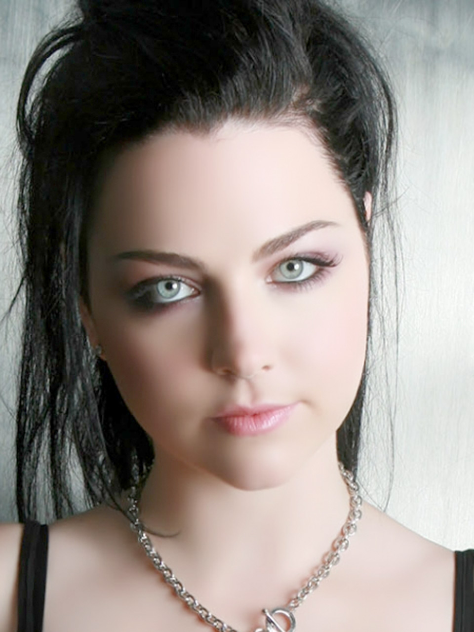
Reference
Even though she looks absolutely stunning in the photo as-is, the painting I envision is something much less conventional; something as unique and vivid as her music. To make this portrait our own, we'll use our artistic license to reimagine it with deep contrast and a vivid color palette.
Create the Sketch
A great painting starts with a great sketch. It allows us to lay out our composition before ever touching brush to canvas. And because acrylic paints are translucent, the sketch will show through the initial layers of paint, providing a guide as we develop our painting. So taking the time to create a detailed sketch is well worth the effort.
If this feels like a challenging composition to draw freehand, you may find it helpful to lightly pencil a grid onto the canvas and a matching grid onto the reference image. This makes it easier to locate objects within the scene.
We start by blocking in the major contours with our HB pencil: the basic edges of the face, hair, and neck. Then, we continue to add more detail: the eyes, nose, and mouth, details within the hair, and the necklace.
Once the contours are complete, we trace over them with an ultra-fine-point permanent marker. This ensures that our contours have enough contrast to show through the initial layers of paint. To give form to our contours, we shade the midtones of our composition using the same HB pencil. And we shade the shadows using a fine-point permanent marker.
Here is the finished sketch:
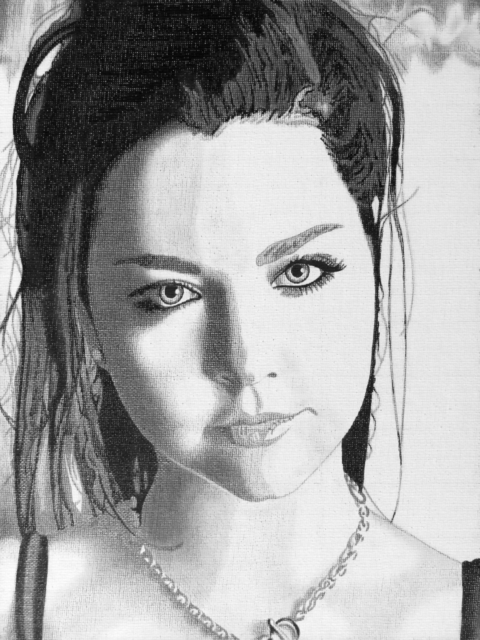
Sketch
Apply the Midtone
With the sketch complete, we're ready to start applying some color. At this stage, we're not concerned with detail. We only want to set the overall tone and temperature of the painting.
If you plan to display your painting without a frame, I recommend painting the edges of the canvas with Mars Black.
- Mars Black
The first layer of paint that we apply to our composition is a translucent glaze of Naples Yellow to create a warm midtone value.
- Naples Yellow
This midtone value sets the overall tone and temperature of the painting. It will also serve as a convenient reference point as we work to develop warmer/cooler and darker/lighter values later on. This layer is typically referred to as the underpainting.
To create a smooth glaze, we add only a little bit of water to the Naples Yellow to reduce its opacity. We then load a small amount of the mixture into a 3/4in filbert brush and apply a thin layer over the entire composition.
The contours and shadows that we shaded with permanent marker should remain clearly visible through the midtone value.
If coverage appears a little thin after the first pass, we can wait for the initial glaze to dry and add another layer by repeating the same process. The desire is to create a meaningful base of color while allowing the sketch to continue to show through.
Here is the painting with the midtone applied:
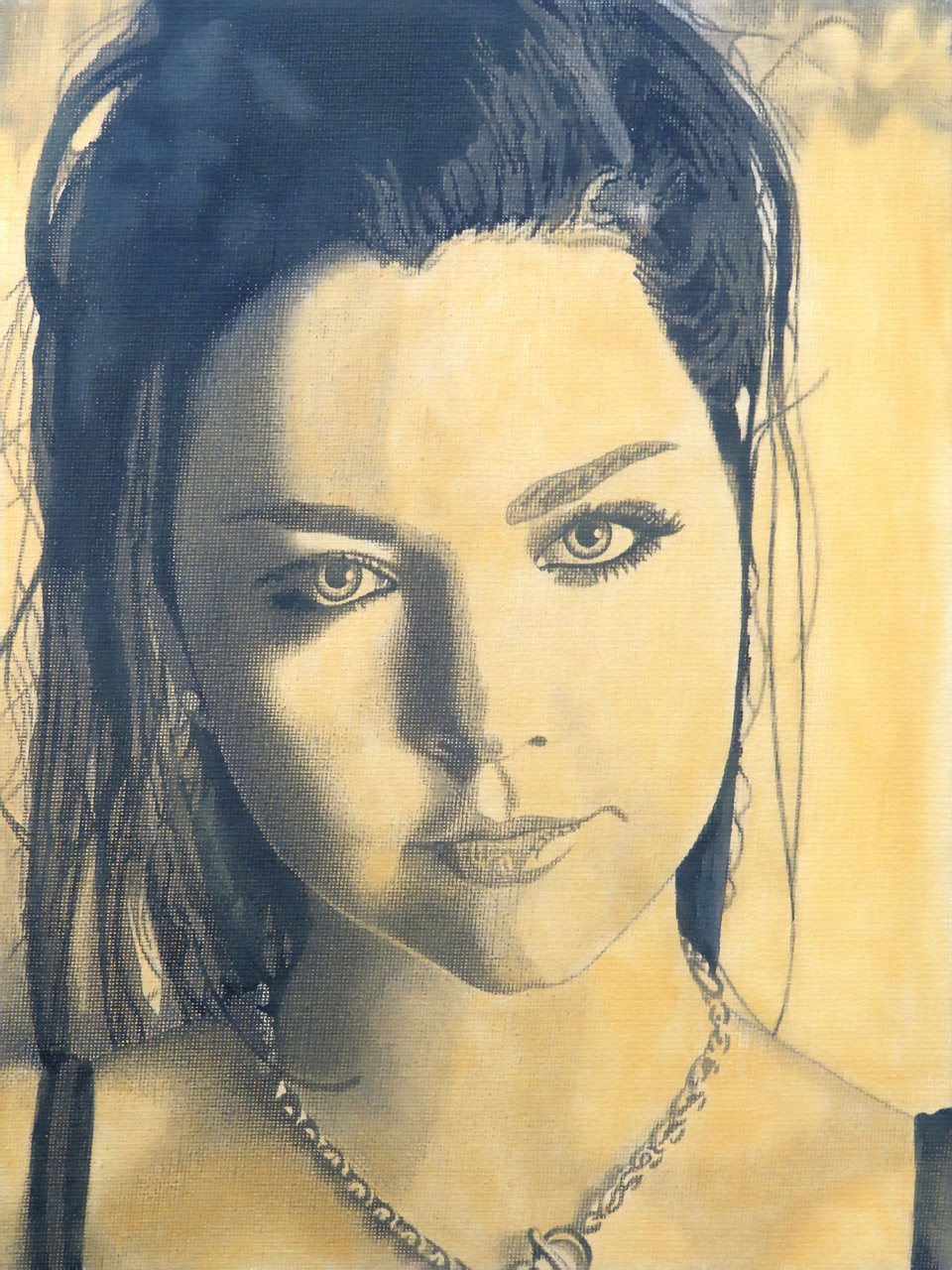
Midtone Applied
Develop the Highlights
With the midtone applied, we are ready to start adding contrast to our portrait. The darker areas of the sketch still show through rather prominently. But the lighter areas have assumed the midtone value. So let's begin by developing the highlights throughout the composition.
For this step, we add one gradient to our palette:
- Naples Yellow
- Titanium White
First, we block in the largest and lightest areas with Titanium White using a 3/4in filbert brush. This layer of paint should be thick and opaque to cover the midtone beneath.
While these areas are still wet, we want to give form to the face by softening the transition between highlights and midtones. We do this by blending outward using values toward the Naples Yellow end of our gradient.
As we encounter facial features like the eyes, nose, mouth, and necklace, we switch to smaller and smaller brushes to work around those areas. First, we switch from our 3/4in filbert to a #8 filbert. Then, from our #8 filbert to a #4 filbert. And finally from our #4 filbert to a #4 round to produce fine details like the whites of the eyes and highlights on the lips.
As we give form to the face, we want to make sure that we're not blending all edges equally. Surfaces that gently curve away from the light source will have a very soft transition between highlights and midtones. Contours that face the light source will retain hard edges. And edges where the hair overlaps the background will be somewhere in between.
Here is the painting with the highlights developed:
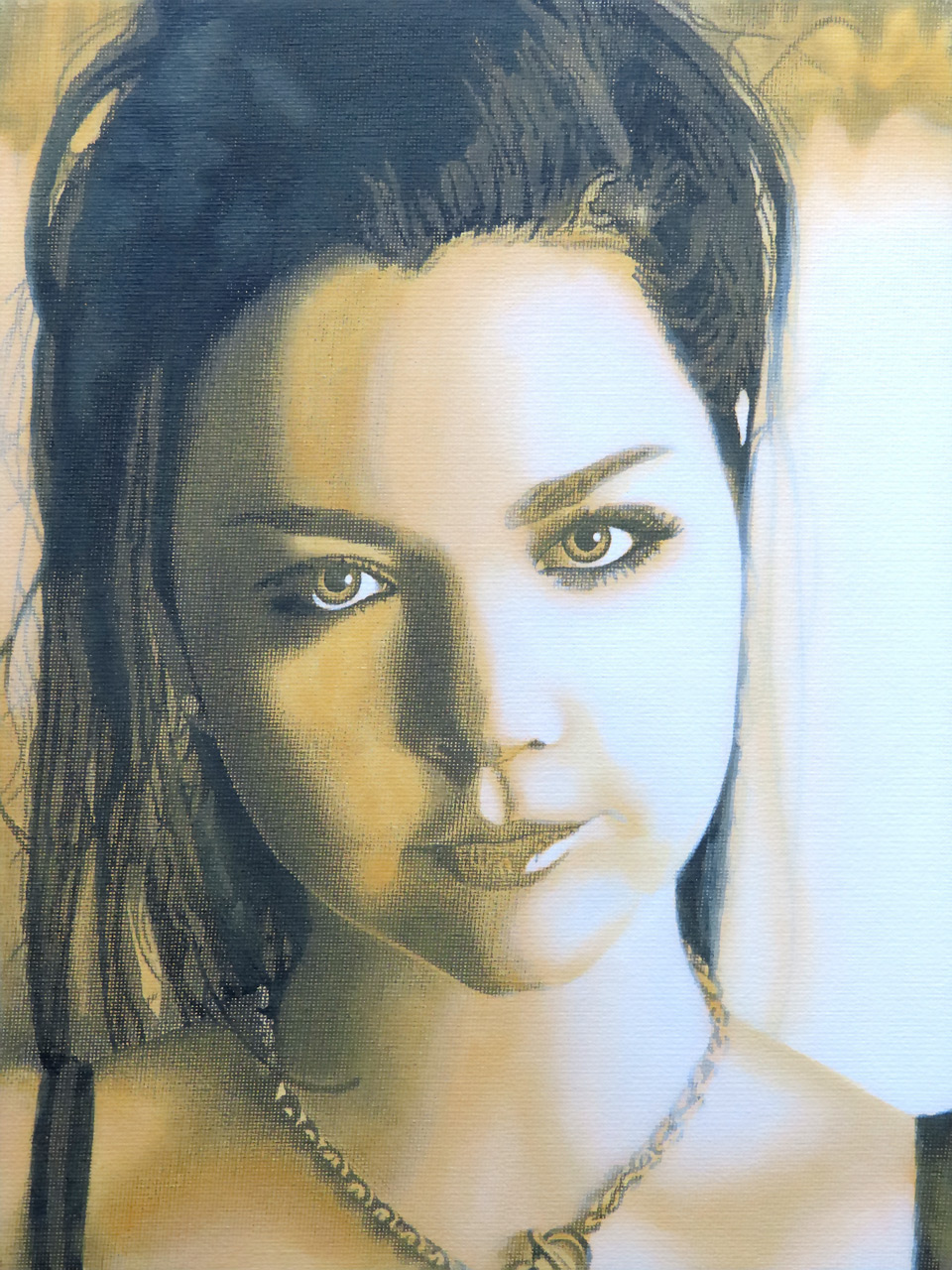
Highlights Developed
Add Vibrance
With the shadows, midtones, and highlights now clearly defined in our portrait, we're ready to make the bold color selections that will give this painting a really unique style.
For this step, we add one gradient to our palette:
- Mars Black
- Ultramarine Blue
- Medium Magenta
- Portrait Pink
- 50% Titanium White and 50% Cadmium Yellow
As with the previous step, we'll work from lighter to darker values. First, we blend our Naples Yellow midtones into Portrait Pink. We block in all of the Portrait Pink areas at once, starting with our #8 filbert then switching to a #4 filbert or #4 round to work around the tighter contours. Working quickly while the paint is wet helps us to feather the edges and keep soft gradients throughout the composition. But don't worry if an area dries before it's fully blended. All we have to do is apply the appropriate hue from the gradient on our palette and blend the fresh paint.
Once the areas of Portrait Pink have been applied, we can continue in this fashion through the rest of the hues in our gradient: Medium Magenta, Ultramarine Blue, and finally Mars Black.
As before, we want to pay attention to soft edges versus hard edges. At this stage, our primary focus is to give form to the face with a vibrant color gradient. This is not a final rendering of the portrait, so we don't need to spend too much time trying to perfectly blend every contour. We'll have the opportunity to refine those areas in the next step.
To my eye, the Naples Yellow midtones appear a bit muted relative to the vibrant hues throughout the rest of the composition. So let's apply a mixture of Titanium White and Cadmium Yellow to make these areas a bit more bold.
Here is the painting with vibrance added:

Vibrance Added
Render the Face
In terms of form development, we completed most of the heavy lifting in the previous step. The basic form is there. All that's left is to refine it.
In this step, we'll use the same gradient as we did in the previous step. But we want to make sure the painting is completely dry before we continue.
If you plan to continue working the same day, the wet palette technique that I recommended at the beginning of this tutorial will keep your paints usable while the canvas dries. You can extend the life of your paints even longer by using a spray bottle to apply a light mist.
If you feel like you're done for the day, no worries. You can simply mix up a new gradient of paint when you're ready to resume.
Once the painting has dried, we are ready to begin applying the next layer. The technique is the same as before. We'll work from lighter to darker values. And for each value, we'll work from large areas with large brushes to small areas with small brushes.
Because the areas we're working have already been roughed in, this step is really about refinement. Here we take the time to soften the edges within our gradients as well as sharpen the contours along hard edges. The purpose of this step is to produce the final rendering of skin. We'll also take the opportunity to complete some of the finer details like the irises and necklace.
Here is the painting with the face rendered:

Face Rendered
Render the Hair and Background
With the face rendered, our painting is really starting to take shape. The only large areas that remain undeveloped are the hair and background. And that will be our focus here.
For this step, we add one gradient to our palette:
- Mars Black
- Ultramarine Blue
- Brilliant Purple
- 50% Titanium White and 50% Naples Yellow
- Titanium White
As always, we start with the lighter values for first and save the darker values for later. Here the lightest values are in the background. So that is where we'll begin.
There's really no discernable detail in the background. And we prefer to keep it soft anyway so that the subject remains the focus of the composition. So our #8 filbert brush is all we need to complete these areas.
We start by applying Brilliant Purple (which, despite its name, is a rather muted value) to the soft shadows of the background. While the paint is still wet, we feather the edges using a mixture of Naples Yellow and Titanium white to blend the shadows into the existing midtones and highlights.
Now we are ready to complete the hair. This is the darkest area of the painting, so we'll be working mostly with Mars Black. Even the highlighted strands are fairly dark, so we'll add these details with Ultramarine Blue. As with the background, we want to keep the hair somewhat loosely defined. So we'll work nearly the entire area with our #8 filbert brush.
Here is the painting with the hair and background rendered:
Hair and Background Rendered
Finishing Touches
At this stage, our painting is nearly complete. All that remains is to add some finishing touches to the eyes and lips.
For this final step, we add four colors to our palette:
- Mars Black
- Cadmium Red
- Cadmium Orange
- Brilliant Purple
Here we add vibrance to the lips by applying touches of Cadmium Red and Brilliant Purple with a #4 and #2 round brush. Using the same #2 round brush, we apply Cadmium Orange to the nostrils. Finally, we switch to a #1 liner brush to render the eyelashes using Mars Black, Cadmium Red, and Brilliant Purple.
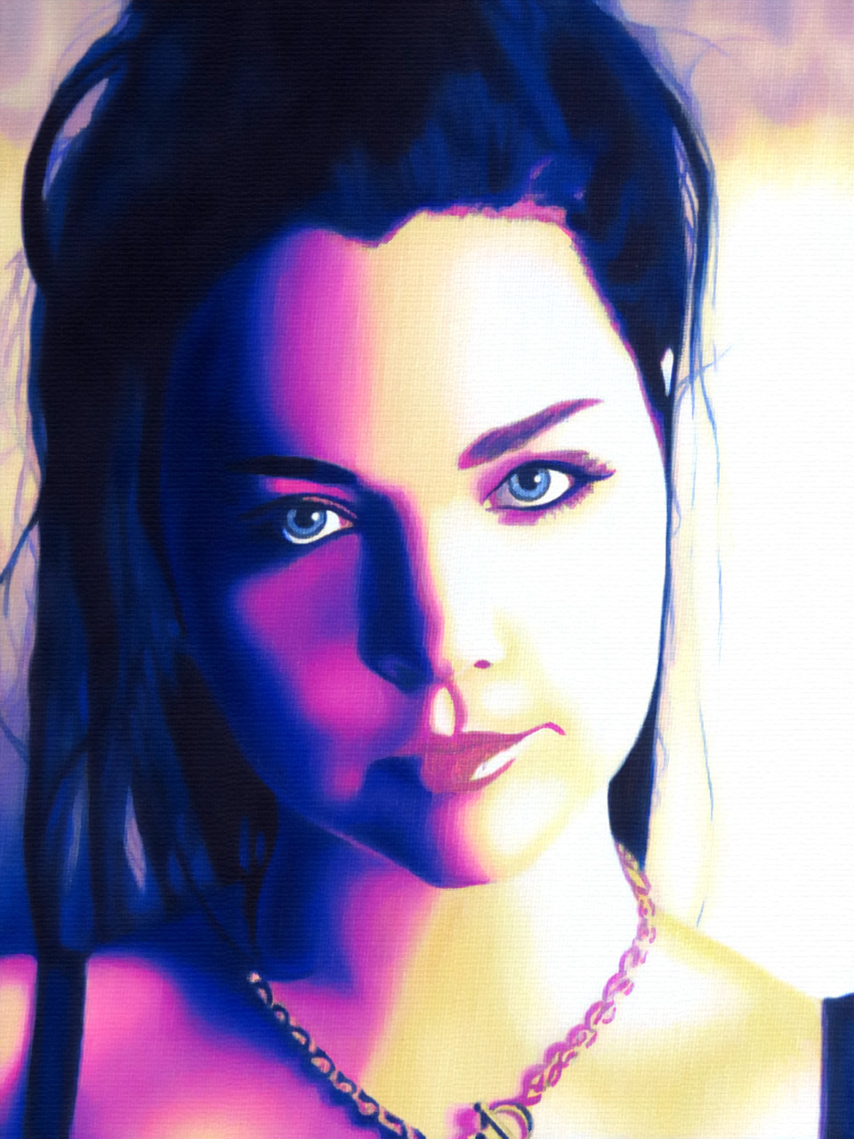
And with that...
Congratulations! Your painting is now finished and ready to sign:
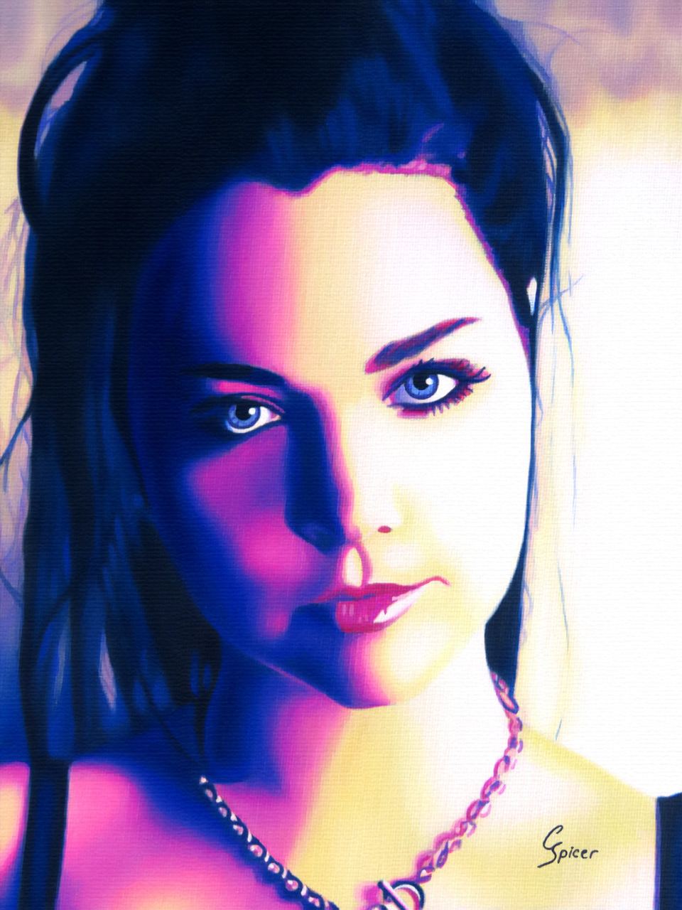
Finished Painting
And there you have it! A beautiful stylized portrait of Evanescence singer and songwriter Amy Lee that you can hang in your home.